There are many reasons an author may choose to self-publish. I’ve chosen to become an indie author because I love not only the writing part of publishing, but also the business side. I’m excited to have creative control over my covers, titles, content, and formats. I also feel empowered to hire my own professional editors and designers, whatever I decide I need to make a quality product for readers. I have control over when I publish, how much I price my books for, and where I put them up for sale.
Cover design is one of the BEST parts. I have so much fun creating covers. That said, I spend a lot of time designing a variety of covers for all my paranormal and contemporary titles. Since I’ll be releasing my paranormal trilogy first, those are the covers I’m spending the most time on.
As an indie author, I have the freedom to make my own rules, at least a little bit. So, I’d like to open up my design direction to readers, writers, authors, bloggers, and the general public. Will you help me decide which direction to choose? Which set of covers appeals most to you?
Please let me know! Vote in the comments section for cover set A, B, C, D, E, F, G, or even H. And now there’s also Z!
Obviously these are not even close to what the final product will look like (And I need to resize), but before I go further, I’m curious which is most appealing to YOU! Some images show the front cover only and others show the full book spread, including cover, spine,and back.
I appreciate your participation. Much love, cecelia ❤
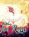
A 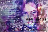
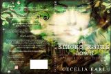

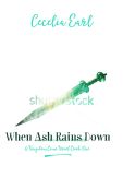
B 


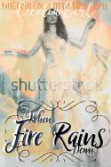
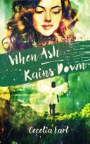
C 

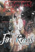
D 

E 


F 


G 


H Keep on working Cecelia. What else can you come up with? Try a completely different direction!
Z 


Z+ 

They’re all beautiful but I keep coming back to C which is so lovely!
LikeLike
C is my favorite, but I like them all! xoxo
LikeLike
These are gorgeous!! You are a multi-talented lady!
Group A is definitely my favorite. I like the brighter colors, plus the swirls and wings in the background, plus I like that model best. In Group B her face being blurred out didn’t work for me. C and D are really nice, too, but the model looks more adult age to me, plus the style is totally different. They are more classic angel/girly. So, that comes down to your character and what represents her best. I get more of a mischievous/kickbutt vibe from group A and B, and then a demure/regal vibe from C and D. Group F is then totally different than the other two themes, and while I love them, I get a more contemporary vibe from them rather than fantasy. Maybe save those for a future book 🙂 E and G are nice, too, kind of a mesh between A,B,C and D.
LikeLike
You’re doing so great with these! Love to see all the iterations as you work through your designs. For me it comes down to feel. Personally, on design alone, I prefer E. Maybe the titles could be stronger visually.
I really like F series, too. The butterfly might read too contemporary.
Can’t wait to read this series!
LikeLike